Fillauer Brand Guide
In 1914, George Fillauer, Sr. started the Red Cross Pharmacy to supply the Chattanooga community with pharmaceuticals, surgical supply, and medical devices. Through the years, Fillauer has evolved and adapted, focusing more closely on orthotics and prosthetics through growth and innovation.
Our brand is about who we are as a company: Innovative, approachable and ready to work with others. As such, the logo, color palette, voice and photography outlined here are expressions of that brand. They are intentional and reflect careful attention to details that evoke the warmth, simplicity, and professionalism we deliver each day.
Style
The basis of our brand aesthetic is a clean, fresh, and professional, yet friendly appearance. Fillauer produces quality, functional devices and our documents should reflect that. Ads, manuals, and presentations should be clear, uncluttered, and to the point.
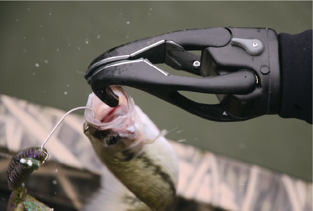
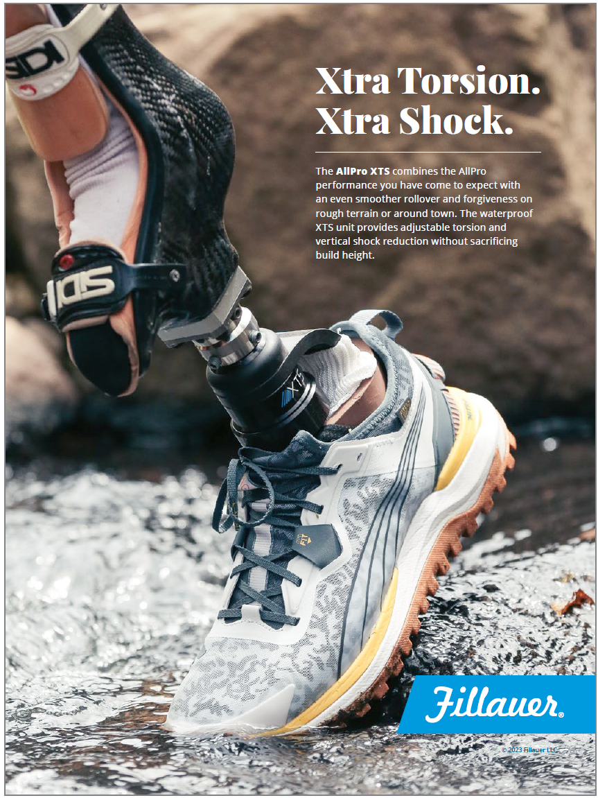
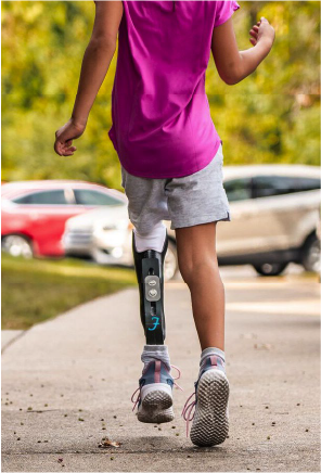
We also want to communicate what we do. Fillauer manufactures devices and equipment that enable practitioners to work with patients to get them back into the world enjoying their lives. That means that we emphasize great photography of patients living their lives to the fullest whenever possible. The image is not about the product, but what that person is doing with that product.
A defining feature of the Fillauer brand is the bright, vibrant fields of blue, coral, and navy. It can be a solid box with reversed text, or blocks angled at 18.5° that mimic the
crossbar of the Fillauer F.
Photos & Videos
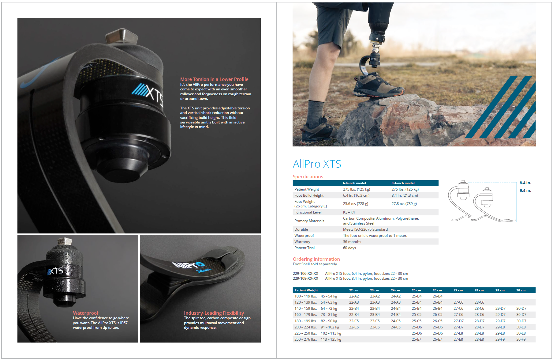
Our photography and videography should inspire our target audiences. Images should represent our end consumers living life to the fullest, happily engaged in their favorite activities, and interacting with friends and family. In some instances photography can more closely highlight the product features and benefits.
Photos and video could demonstrate product usage, testimonials, or step-by-step fabrication. Images produced internally should be at a level of quality that uplifts the Fillauer brand.

Voice
Our voice is our brand personality and remains consistent across all audiences and channels. Communications should always portray the following traits:
Friendly & Approachable
We speak to you on your own terms, making complex matters easy to understand.
Experienced & Confident
We’re proud of our legacy, we’re great at what we do, and we use our experience to adapt to the changing needs of the industry.
Focused, but Agile
We never lose sight of the big picture. We focus on our purpose, but quickly make course corrections as needed.
AUDIENCE & TONE
While our voice always remains the same, the tone should be tailored to each audience. Tone needs to consider what an audience expects to hear and its level of knowledge regarding the subject matter.
For example, materials intended for the practitioner or technician should be professional and straightforward. The tone should be informative, using the industry language that the audience expects to hear, and presented in a clean, direct manner.
On the other hand, communications intended for patients should be inspirational and welcoming. Visually, there’s a greater emphasis on patient photography and typographically more human. Copy should be friendly and relatable without seeming obvious or condescending. The tone for this audience should also be professional, but not overly formal.
Logos & Usage
The Fillauer logo is the brand identifier for all Fillauer locations. The tradition and familiarity of the logo represents a strong, well-established brand. The F has been modernized to reflect the brand’s future.
Positive & Negative
Ideally, the best representation of the Fillauer logo is against a light background or reversed out of our corporate blue background. A black version is available when color isn’t an option.
![]()
The Registration Mark
Fillauer is a registered name. In order to protect the name and the brand, the registration mark was added to the logo. The registration mark must be used at a minimum of once on each page of a document.
Minimum Size
When reproducing the Fillauer logo, it should be a minimum of 0.5 in. (13 mm) wide.
Clear Space
To maintain the visual impact of the Fillauer logo, never place any graphic or typographic element closer to the logo than the minimum clear space indicated here by the height of the “a” in the logo.
Protect the Brand
Distorting or altering the Fillauer logo in any way compromises the integrity of the brand. Please don’t:
- Fail to use the logo on communications
- Distort the logo in any direction or shape
- Rotate or tilt the logo
- Change the original logo color
- Reset the font or try to recreate the logo

Angled Box Logo
An angled box is a common way to contain the Fillauer logo in advertising materials. This helps set it apart from busy photos or backgrounds. The box should bleed off the page and the logo element should sit at the document margin. There are options for the left or right side of the page.
Angled Box Usage
These logos are designed to be used on the left or right hand edge of the page. Please don’t use them in any other place such as the middle of the page. The logo files have absurdly long boxes to discourage this behavior.
Protect the Brand
Distorting or altering the Fillauer box logo in any way compromises the integrity of the brand. Please do not:
- Distort the logo in any direction or shape
- Fail to crop the box
- Rotate or tilt the logo
- Change the original logo color
- Reset the font or try to recreate the logo
- Place in position other than the edge of the page
The FIllauer “F”


Brand Colors
We have adjusted our corporate blue color to better distinguish us from our competitors. By lightening our blue, we project a bright, pleasing appeal. We have added coral, navy, and gray as secondary colors to help support the brand story.
Color Hierarchy
Fillauer Blue should always be the focus color. The gray should primarily be used for text and charts and the coral used as an accent color, especially for use in patient-focused media.
Combinations to Avoid
Avoid using solid blue and solid coral on top of each other. The nature of these colors will fight against each other and cause confusion for the eyes.
Conditional Use of Secondary Colors
Some situations, such as charts and info graphics, may benefit from additional color options. In these situations the navy may be added, but only after the blue and coral have been used.
Pantone Process Blue
CMYK 100/15/0/0
RGB 0/133/202
#0085ca
Pantone 2029
CMYK 0/65/46/0
RGB 244/133/121
#f48579
Pantone Cool Gray 9
CMYK 0/0/0/60
RGB 130/130/130
#828282
Pantone 2955
CMYK 97/66/34/16
RGB 0/68/102
#004466
Typography
Avoid using all caps when writing text. When creating headlines and body copy, use upper and lower case letters to ensure words are easy to read.
Open Sans
Open Sans was designed with a neutral, yet friendly appearance. Use Open Sans in all Fillauer marketing communications to help build visual consistency across the brand.
Playfair Display
Playfair Display Black is used in headlines when a little more personality is needed, especially in patient-focused media. Be sure that it is used in a high contrast area. The delicate nature of the typeface means that it can be unclear if used in busy areas or low contrast colors.


Do you have questions or need clarification on this brand guide? Email [email protected] with your request.