Hanger Foundation Brand Guide
Hanger Foundation Brand Guide
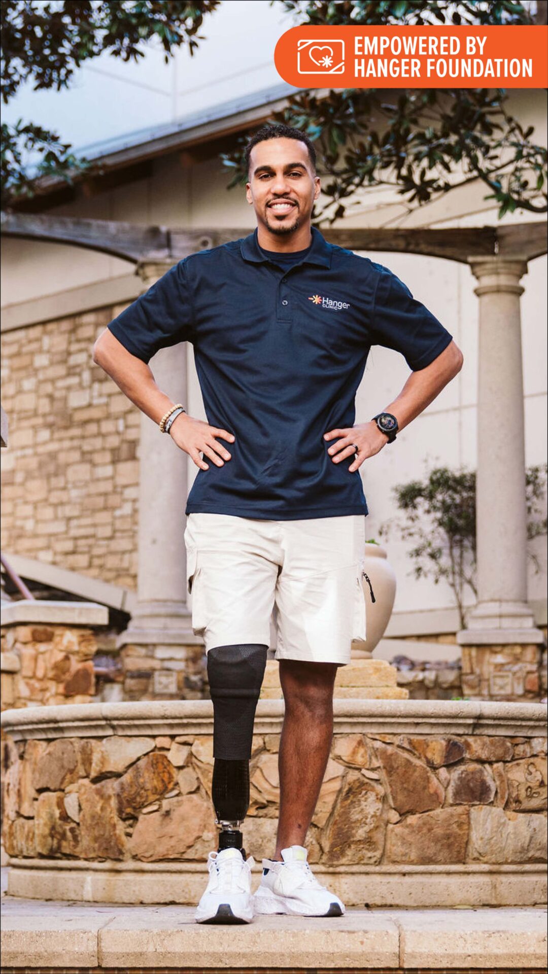
The Hanger Foundation exists to empower people with physical challenges to live life as fully as possible. Rooted in compassion and driven by impact, we partner with grassroots nonprofits and academic institutions to unlock opportunities that foster independence, inclusion, and innovation. Through grants, scholarships, and global outreach, we break down barriers and build bridges—transforming lives and advancing communities.
Our brand is really about who we are—innovative, friendly, and committed to meaningful collaboration. The choices we make in our logo, colors, voice, and photography aren’t random. They’re thoughtfully designed to reflect the warmth, clarity, and professionalism we bring to everything we do. It’s all about showing, not just telling, how we connect and collaborate with purpose every day.
Style
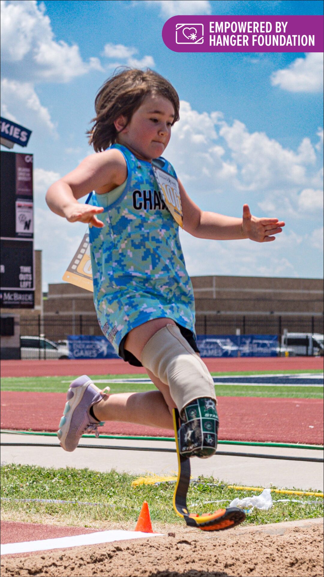
Our visual identity is rooted in joyful engagement and authentic community representation. While our overarching aesthetic is fun, vibrant, and welcoming, our visual style is event- and campaign-driven, allowing us to adapt creatively to the unique spirit of each initiative and the communities we serve.
Each visual expression should:
- Reflect the essence of the event or campaign, drawing inspiration from its purpose, audience, and energy.
- Honor the identity and culture of our grantees, ensuring their voices and stories are central to the design.
- Foster a sense of community, using imagery, color, and layout to convey connection, collaboration, and shared impact.
- Balance playfulness with purpose, ensuring that while visuals are engaging and dynamic, they remain respectful and mission-aligned.
This flexible yet intentional approach allows our brand to remain cohesive while celebrating the diversity and vibrancy of the people and causes we support.
Voice
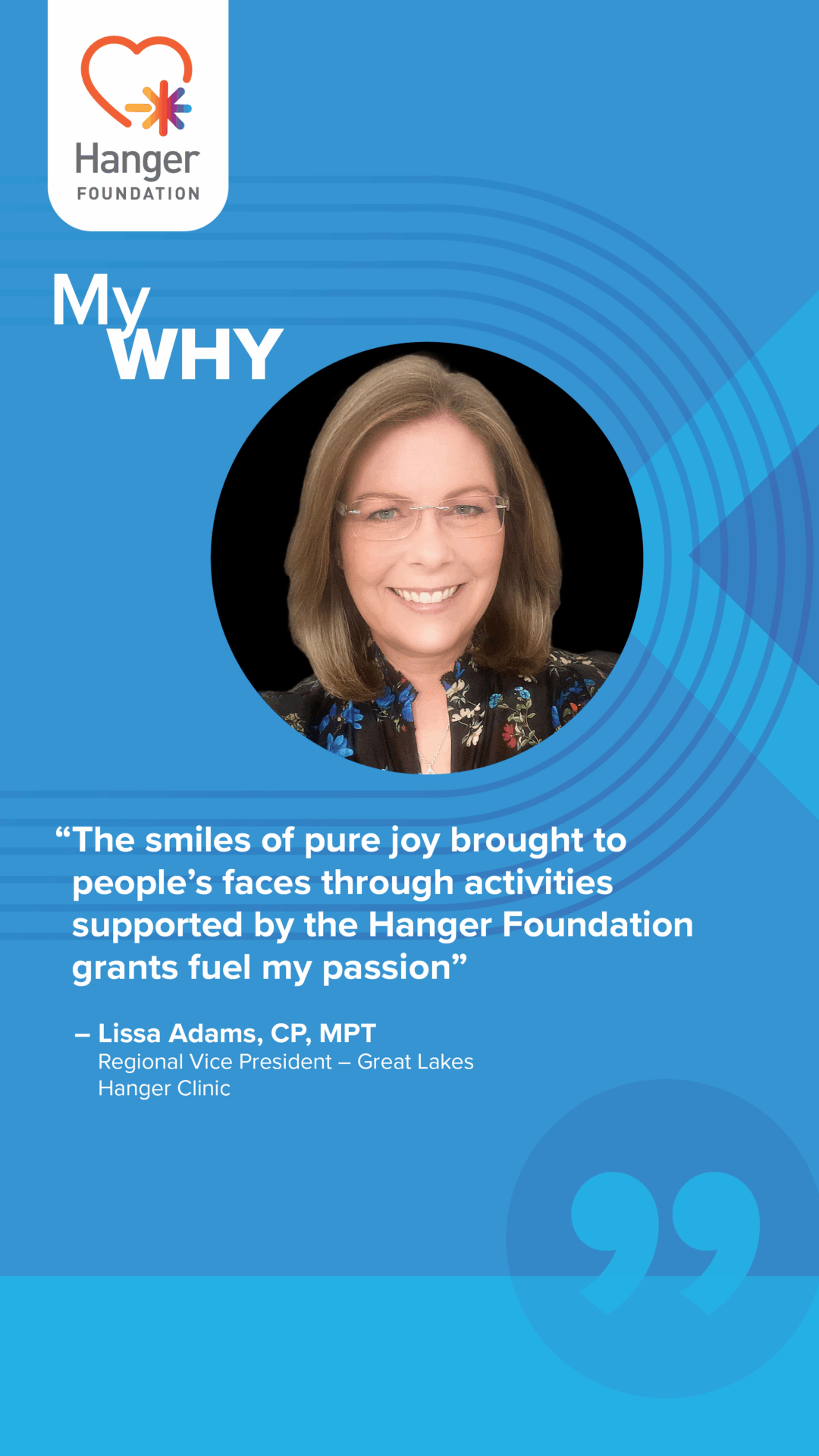
Our brand voice is professional, sincere, and designed to reflect the care we bring to every interaction.
It’s not just how we speak—it’s how we show up. Every word, color, and image is intentional, chosen to express the warmth, clarity, and professionalism we deliver each day. We believe in honest communication that builds trust, and we tell stories—real stories—about the people and organizations we serve. Their journeys inspire us, and through storytelling, we invite others to see the impact, the innovation, and the heart behind our mission.
Communications should always portray the following traits:
Speak with Professionalism
- Use language that’s clear, thoughtful, and respectful.
- Choose words that reflect expertise and demonstrate care in communication
Lead with Integrity
- Be honest and transparent—avoid jargon and overstatement.
- Earn trust by communicating with consistency and authenticity.
Tell Purposeful Stories
- Highlight real people and organizations that shape your impact.
- Weave narratives that show innovation, collaboration, and excellence—not just say it.
Logos & Usage
The Hanger Foundation logo is used solely as a brand identifier, representing its support and partnership. All usage must follow Hanger Foundation's approved branding standards and visual identity.
Background Permissions
Be sure to select the appropriate logo color based on the background to ensure proper contrast and legibility. Questions? Contact [email protected].
Clear Space
A safe area should always exist around the logo to allow for clear brand identification. No elements, such as typography, other logos or graphics, should intrude into the safe area. Safe area is equal to “X,” which is equal to the height of the box in the logo.
![]()
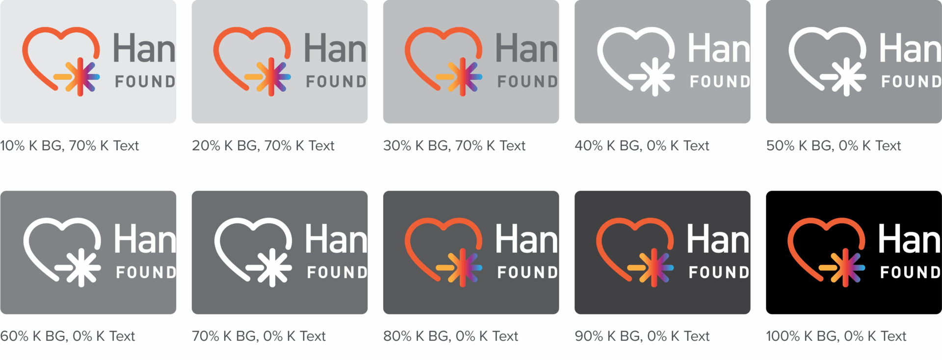
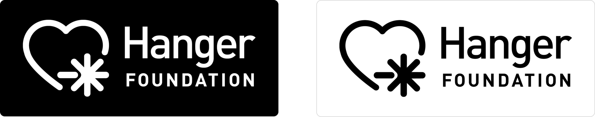
One Color Variations
The logo may be used in black, white for applications requiring less than 4C printing. For a light field, use the black version. For a dark field, use the white or reversed out version.
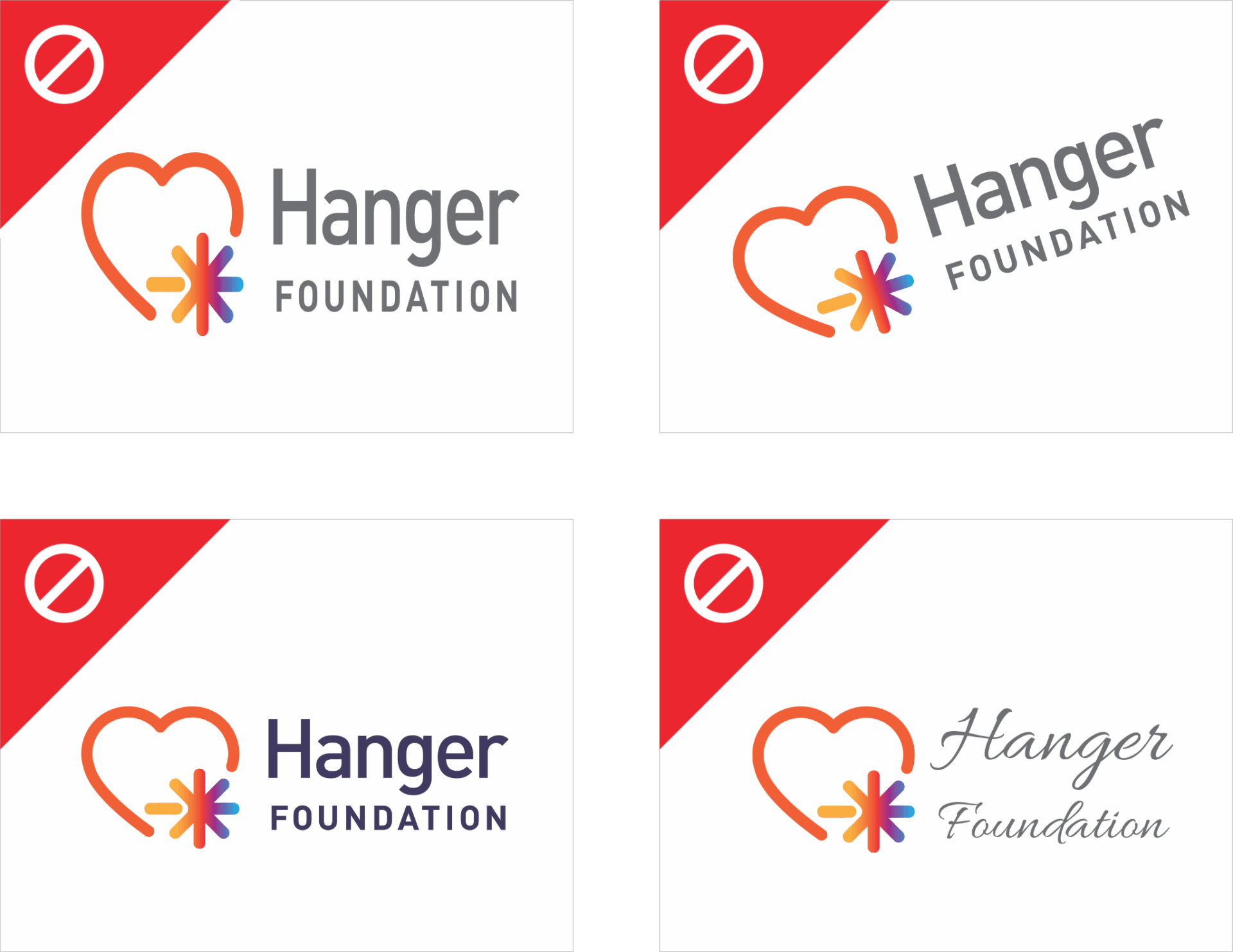
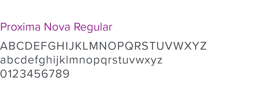
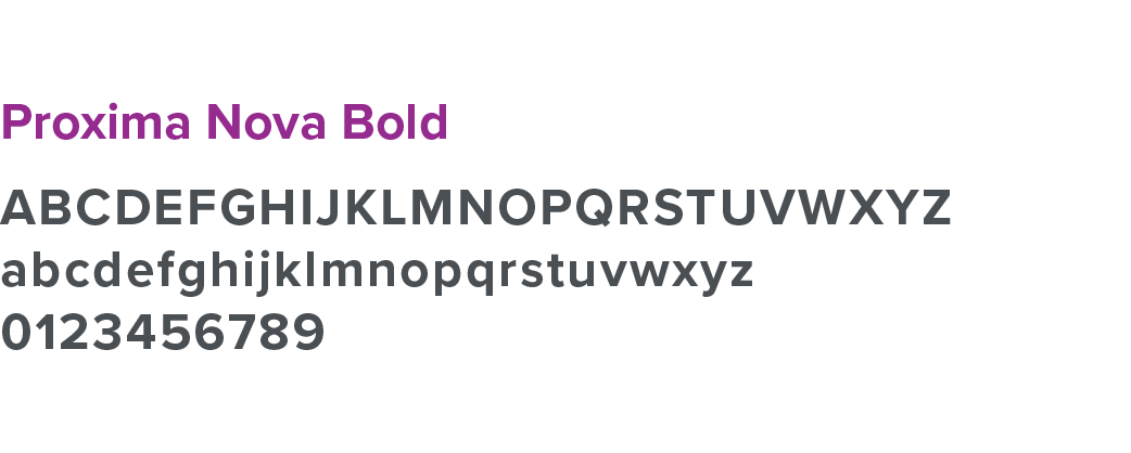
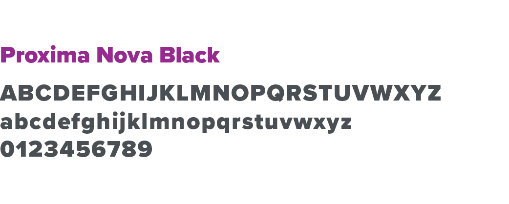
Protect the Brand
Distorting or altering the Hanger Foundation logo in any way compromises the integrity of the brand. Please don’t:
- Fail to use the logo on communications
- Distort the logo in any direction or shape
- Rotate or tilt the logo
- Change the original logo color
- Reset the font or try to recreate the logo
Brand Colors
Color plays a powerful role in brand building and brand recognition. Using the formulas specified below will ensure the best color match for all mediums.
Red Orange
HEX #ff5f2f
RGB (255, 95, 47)
CMYK (0, 78, 87, 0)
Orchid
HEX #952890
RGB (149, 40, 144)
CMYK (48, 99, 0, 0)
Plum
HEX #403a60
RGB (64, 58, 96)
CMYK (82, 82, 36, 26)
Blue
HEX #00b3f0
RGB (0, 179, 240)
CMYK (69, 11, 0, 0)
Dark Gray
HEX #4a4f54
RGB (74, 79, 84)
CMYK (69, 59, 53, 33)
Gray
HEX #6e6f72
RGB (110, 111, 114)
CMYK (58, 49, 46, 14)
Ghost Gray
HEX #f4f4f4
RGB (244, 244, 244)
CMYK (4, 2, 2, 0)
Hanger Foundation Gradient
Red-Orange (0%), Orchid (100%)
Typography
Avoid using all caps when writing text. When creating headlines and body copy, use upper and lower case letters to ensure words are easy to read.
Proxima Nova
Proxima Nova serves as the cornerstone of our brand’s visual identity. Its extensive range of styles and weights—combined with a refined balance of timeless and modern design—makes it an ideal choice for representing the mission and values of the Hanger Foundation.
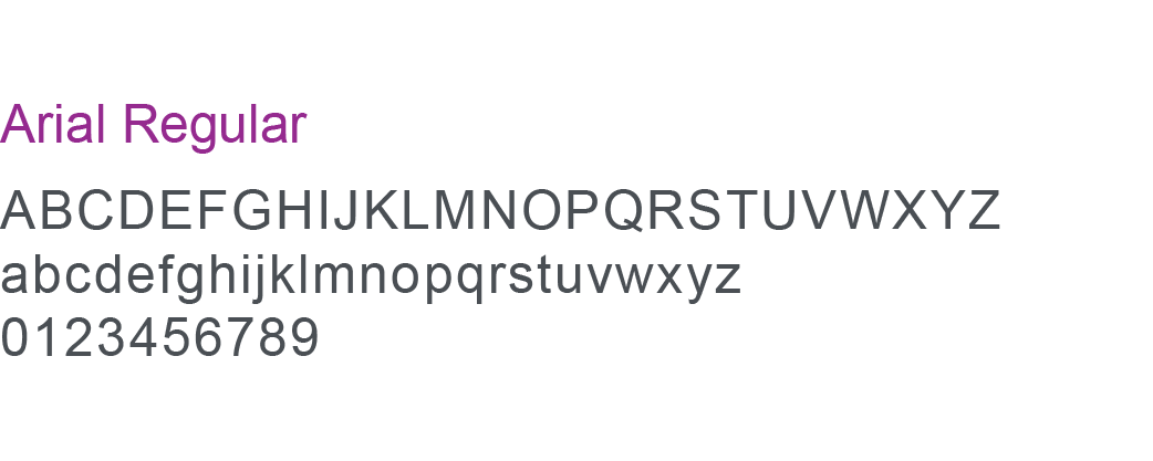
Arial
In instances where Proxima Nova is unavailable, the Arial font family should be used as a substitute. As a widely accessible typeface, Arial helps maintain visual consistency across Hanger Foundation communications when the preferred font is not an option.
Do you have questions or need clarification on this brand guide? Email [email protected] with your request.