SPS Brand Guide
SPS
SPS is the nation’s leading supplier of prosthetic and orthotic supplies. A true partner to independent O&P clinics, we understand the frequent changes in technology and healthcare policy and are committed to providing you with resources you need to make shifts in your practice that improve patient outcomes.
The purpose of this style guide is to explain the brand style and ensure consistent application of the visual elements across all communications, both online and offline.
Co-Branding Guidelines
As the SPS brand continues to evolve, it is essential that we maintain a clear impression of our identity to our customers and partners. All co-branded material requires approval by the SPS Marketing Department before it is distributed. Email [email protected] for approval.
- The SPS Secondary logo and CTA must be used on all co-branded marketing pieces that represent SPS
- The SPS Secondary logo and other graphics can be downloaded below
- Only the SPS CTA should be added to co-branded materials
- All supplier CTAs, including website urls, social media, or contact information should be removed
- No attempt should be made to change or recreate the SPS logo
Catalogs, Collateral, & Ads
When co-branding printed materials, use the logos in the assets folder provided to you by the SPS marketing team and follow the placement guidelines below. Email [email protected] for folder access.
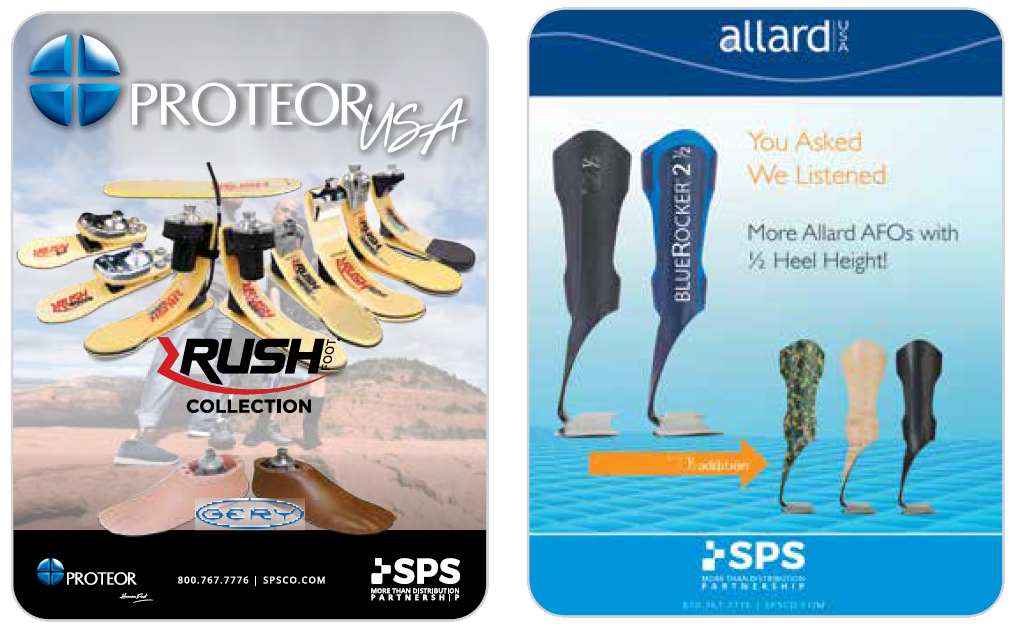
| Example A | Example B |
 |
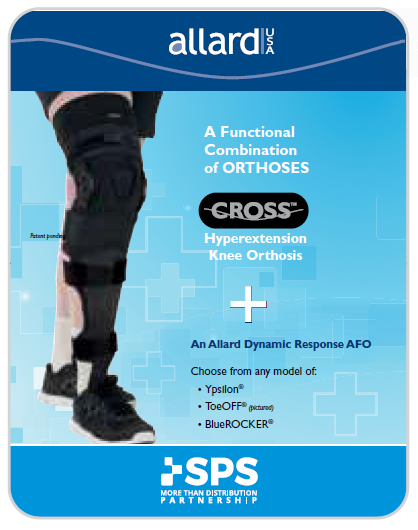 |
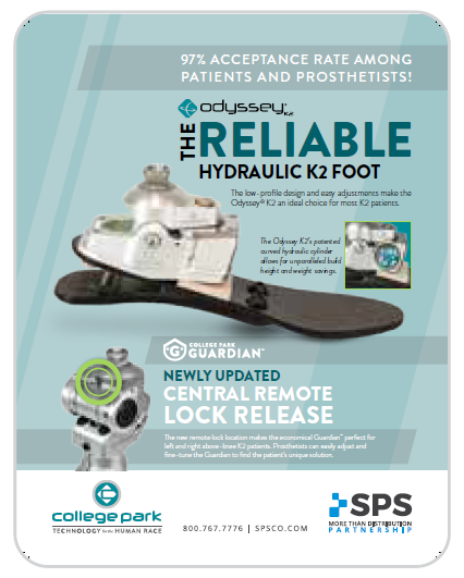
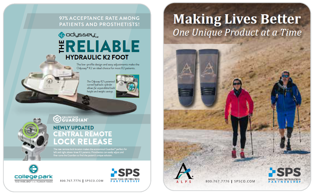
| Place supplier logo and the SPS Secondary logo on the bottom of the page, ensuring the two logos are congruent. Center the SPS CTA between the logos and bottom-align with “partnership.” | If a supplier logo is centered at the top of the page, the SPS Secondary logo should be centered at the bottom of the page. |
Logos for Light Backgrounds


Logos for Dark Backgrounds

Logos & Usage
The SPS logo represents connecting customers with products and services from supplier partners around the world, and the business growth that is the result of improved supply chain processes.
Tips when using logo:
- Avoid using the logo or tagline on photo backgrounds
- Always use the transparent/white logo or tagline on solid color backgrounds. Never use the logo or tagline in a box (the boxes below are for visual purposes only)
- Never rotate or stretch the logo or tagline


Logo Sizes
![]()
PRIMARY LOGO SPACE + SIZING
The SPS logo should be a minimum of 0.5” in height to avoid issues with legibility. The logo should always have at least .5” of white space around it for visual distribution.
![]()
SECONDARY LOGO SPACE + SIZING
The SPS logo should be a minimum of 0.75” in height to avoid issues with legibility. The logo should always have at least .5” of white space around it for visual distribution.

SPS TAGLINE SPACE + SIZING
The SPS tagline should be a minimum of 0.3” in height to avoid issues with legibility. The tagline should always have at least .5” of white space around it for visual distribution.
Typography
Headers
Barlow | Use this font for all headers. The font color should be pebble or SPS blue. Headers may be capitalized or title cased.
Barlow Regular

Print & Web Body Copy
Open Sans Regular or Open Sans Bold | Body copy should always be sentence case and the font color should be pebble. In some cases where there is highlighted text, SPS blue can be used.
Open Sans

Open Sans Bold

Business Documents & Email
Calibri Regular or Calibri Bold | Body copy should always be sentence case and the font color should be pebble. In some cases where there is highlighted text, SPS blue can be used.
Calibri Regular

Calibri Bold
Colors
Primary Colors
SPS Blue
CMYK: C=100, M=20, Y=0, K=0
RGB: R=0, G=149, B=218
HEX: #0095DA
Pebble
CMYK: C=0, M=0, Y=0, K=90
RGB: R=65, G=64, B=66
HEX: #414042
White Smoke
CMYK: 0, 0, 0, 3
RGB: 247, 247, 247
HEX: #F7F7F7
Secondary Colors
Royal Blue
CMYK: C=100 M=75, Y=29, K=12
RGB: R=0, G=74, B=121
HEX: #004A79
Sea Foam
CMYK: C=66, M=0, Y=32, K=0
RGB: R=65, G=194, B=188
HEX: #41C2BC
Gray Stone
CMYK: C=24, M=19, Y=20, K=0
RGB: R=193, G=193, B=193
HEX: #C1C1C1
Do you have questions or need clarification on this brand guide? Email [email protected] with your request.