SureFit Brand Guide
SureFit
SureFit is a one-stop-shop for lower extremity solutions, document management, and practice support. As the world of healthcare evolves, we evolve along with our practitioners. We understand their priority is patient care, so it’s our mission to continually expand our business to give them back time to spend with patients. We are committed to providing practitioners with resources they need to make shifts in their practice that improve patient outcomes.
The purpose of this style guide is to explain the brand style and ensure consistent application of the visual elements across all communications, both online and offline.

Co-Brand Guidelines
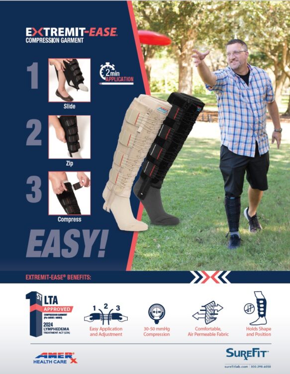
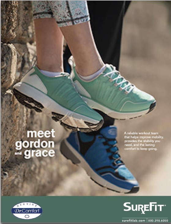
As the SureFit brand continues to evolve, it is essential that we maintain a clear impression of our identity to our customers and partners. All co-branded material requires approval by the SureFit Marketing Department before it is distributed. Email [email protected] for approval.
- The co-brand logo should only be used with co-marketing material
- The co-brand logo should always be used with CTA
- Width of logo shouldn’t exceed 2”
- Logo should always be proportional in width and height
- Blue and white versions of the co-brand logo are available for use on light and dark backgrounds
Logos & Usage
The SureFit logo represents connecting customers with products and services from supplier partners around the world, and the business growth that is the result of improved supply chain processes.
Primary Logo usage
- Primary logo should be used on SureFit material only
- Width of logo shouldn’t exceed 2”
- Logo should always be proportional in width and height
- Logo can be used with or without the swoosh
- Not to be used with cobranded collateral
Swoosh Usage
- Swoosh should be used on SureFit material only
- Swoosh should always extend the width of the page
- Swoosh can be used with or without primary logo
- Not to be used with cobranded collateral
Using Logo on Backgrounds
Do
Only use the logo on black, pastel gray, or white backgrounds.


Don’t
Do not use the logo on any other color background.


Typography
Primary
Montserrat | Use cases: website, marketing materials | Colors: Dark Imperial Blue, Pebble, White Smoke

Secondary
Trebuchet MS | Use cases: email, internal communications, signatures | Colors: Dark Imperial Blue, Pebble, White Smoke

Colors
Primary Colors
Dark Imperial Blue
HEX: #004F71
RGB: 0, 79, 113
CMYK: 100, 30, 0, 56
Pastel Gray
Hex: #CECFCE
RGB: 206, 207, 206
CMYK: 0, 0, 0, 19
White Smoke
Hex: #F7F7F7
RGB: 247, 247, 247
CMYK: 0, 0, 0, 3
Secondary Colors
Vivid Cerulean
Hex: #00A3E0
RGB: 0, 163, 224
CMYK: 100, 27, 0, 12
Tomato
Hex: #F06449
RGB: 240, 100, 73
CMYK: 0, 58, 70, 6
Pebble
Hex: #414042
RGB: 65, 64, 66
CMYK: 0, 0, 0, 90
Do you have questions or need clarification on this brand guide? Email [email protected] with your request.
